It’s Tuesday, April 7, 2026 in Austin, Texas
What is Responsive Web Design?
The core concept behind "responsive web design" is to implement a single website that is optimized for easy viewing and use regardless of the device and its display size.
In the last few years, there has been tremendous growth in users accessing websites from mobile devices like smartphones and tablets. These devices generally have much smaller displays than desktops or laptops, and so traditional websites required lots of scrolling and zooming in/out to view. This lead to new techniques to make websites mobile friendly, and ultimately the concept of "responsive web design."
The primary goal of a responsive website is to enhance the user experience by providing content in a way that automatically adjusts to screen dimensions.
Responsive websites seek to:
- Provide easy access to menu items - making key navigation obvious and easy to click on.
- On very small devices - menus may collapse into a button (usually indicated with 3 bars) that expands when clicked on to view the entire menu.
- Minimize or eliminate zooming in/out to view the majority of content.
- Minimize or eliminate horizontal scrolling.
- Text should be a legible without having to zoom in.
- Pictures automatically resize so that they don't exceed the width of display.
- When appropriate, lower resolution photos maybe used to reduce bandwidth and speed up display time.
- Content blocks are repositioned to fit browser display dimensions.
- Key content maybe positioned higher, and less important content may even be hidden on smaller devices.
Most often CSS "media queries" are used to determine a browser's display characteristics, and then serve up slightly different versions of the website based on those characteristics.
The most important element to look at is usually the display width -- how many pixels of content can be displayed horizontally? To eliminate horizontal scrolling and zooming, content should not exceed the width of the browser display.
Apple's iPhones are extremely popular, and despite "pixel doubling" screens on later models - the effective width on an iPhone held in "portrait" mode is only 320 pixels. In a responsive design, any content that would exceed 320 pixels would be repositioned or resized not to exceed that width. Thus, if you had 4 blocks of 300 pixel content positioned horizontally in a desktop design (that was say 1280 pixels wide), you might instead stack those 4 blocks of content vertically on an iPhone display.
Most responsive designs essentially use grids, or blocks of content that can be rearranged in different ways to fit different displays.
Important points to understand about websites that use "responsive web design" -
- The design will display differently based on the screen width.
- The smallest version may not look exactly like the largest version - the smaller the screen size the more content has to be repositioned.
- While horizontal scrolling maybe eliminated, vertical scrolling increases as more content is stacked vertically.
- Realize that the "largest" desktop version may look better than the "smallest" version.
- Responsive design generally eliminate the scrolling and zooming in/out that is required when viewing a non-responsive website.
- Text may wrap differently as content boxes reposition and resize - text should always be kept at a legible size.
- Generally graphics with text should be avoided, and they may not be legible when resized down for a smaller display.
- It takes extra time, knowledge, and experience to build a responsive website.
If you'd like to work with the top Austin Web Design Company, we're here to help. Get a responsive web design quote now!

AUSTIN
the most beautiful
My Top Ten Most Beautiful Pictures of Austin
I have spent years looking at pictures of Austin - and these are my favorites - the most outrageous beauties! I have added some comments about colors and life in Austin.
TECH ADVICE
stop them once and for all
How to End Annoying Robocalls - OMG a Solution!
Get rid of Robocalls. There is a free solution that really works - it's called Nomorobo and we love it.
WEB DESIGN
big breakthrough in color research
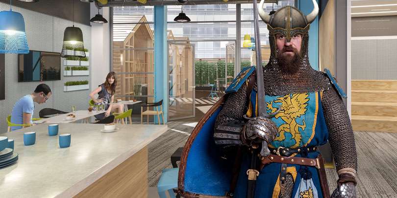
Want to Use the Viking Color Palette in Your Website?
Scientists have discovered the favorite Viking colors and now you can use them in your website!

WEB DESIGN
be prepared - choose wisely
Checklist for Law Firms Looking for a Web Designer
Here are some helpful hints and direction on the skills and knowledge your web designer should have.
WEB DESIGN
essentials for success
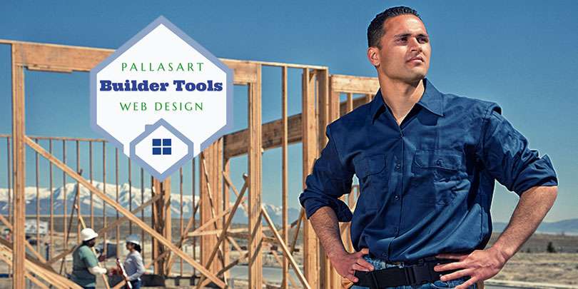
New Home Builder Website Checklist
Here's a list of the essentials you'll need to create your new home builder website. It's a list of all of the building blocks you'll need to make your site a success.

WEB DESIGN
max speed
7 Tips to Speed Up Your Website
Optimizing the speed that your website's content loads - will inevitably increase customer satisfaction, keep them on your website, reducing its bounce rate, and hopefully make them return visitors.

AUSTIN
save as many as you can!
Top 10 Reasons NOT to Move To Austin
With Austin making headlines and ending up on virtually every "Top 10 Best City for..." lists -- we now have about 150 people moving here daily!! We figured we should warn potential new residents of the hidden dangers of moving to Austin.

ANCESTRY RESEARCH
Howdy Grandmother!
Pocahontas ancestry and DNA - Sullivan Family Connection
How I discovered my ancestor Pocahontas and her Sullivan family descendants of Northern Virginia using the web - a genealogy posting by Bob Atchison.

Anonymous Love Letters - $500
Did you know that really was a profession? In 1961 you got paid $500 per letter, that would be $4100 today!

SEO Tips for Home Builders
When we build a new website for our home builder clients, we always try to focus on implementing "best practices search engine optimization (SEO)" to maximize their placement in organic search engine results.

GEDmatch Used to Snare Golden Gate Killer - Hackers Get MyHeritage Data
As you have probably read it has been extensively reported that Golden Gate Killer was found using data from GEDmatch. It's an amazing story.
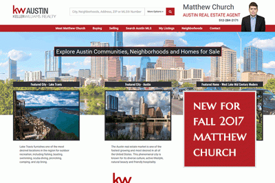
Keller Williams Real Estate Agent Website Created
Pallasart launches new real estate website for Matthew Church, an Austin Keller Williams Associate. The site has many cool features that will help Matthew offer his services and attract new customers.
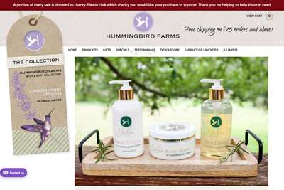
Hummingbird Farms Upgrades Images on their Website
Hummingbird Farms, the famous maker of body lotions seen on QVC , upgrades website with huge new product images, which increases sales
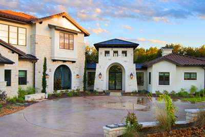
Top Texas Home Builder Redesigns Website
Olson Defendorf, the top award-winning Texas custom home builder, creates a new brand image and redesigns website. Click here to see what they just did in 2018.

The Best Antique Roses for Your Austin Garden
Here's a list of the best antique and old roses for your Austin garden plus a few recommended David Austin Roses

Maine Resort Redesigns Website
The Moorings in New Harbor did a total redesign of its website and added an availability and booking system.
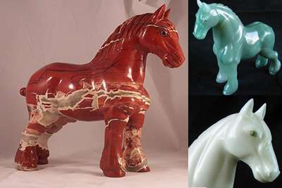
My Favorite Semi-Precious Stones for Hardstone Animals
Here are some images showing my favorite semi-precious stone animals with jeweled eyes from my collection and stories of the stones and where they come from.

Why do my website fonts and photos look blurry in Windows 10?
When users install or upgrade to Windows 10, "display scaling" may be turned on "by default" to either 125% or 150% resulting in blurriness when viewing websites or applications on certain monitors.

5 Common Website Mistakes to Avoid Making
We've been in the web design business since 1996, and have seen many small businesses make these easily avoidable but often costly mistakes with their websites.
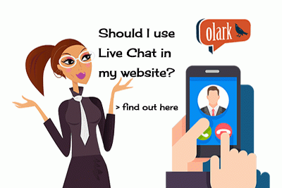
Should You Use Live Chat in Your Website?
Here's an informal overview of live chat options, outlining how Olark, one of the leading providers, works and its features. We explain how live chat can increase online sales and generate leads no matter the size of your company.
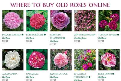
Where to Find and Buy Old, Antique and David Austin Roses Online
Bob Atchison's guide to find rare, antique and cabbagey roses to order online. Here you'll find the best sources with roses I especially love and recommend for your garden.

How to Add MLS Listings to Your Real Estate Website
If you are a realtor or real estate broker, you need a website to advertise your business and attract new clients. Get clients to stay on your website by providing access to Multiple Listing Service (MLS) real estate listings.
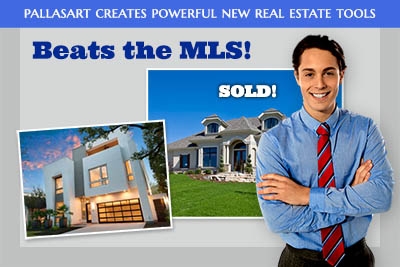
New Real Estate Web-Tools Just Released
Now it's possible to have a website that surpasses the very best in real estate. You can get an incredible design with powerful databases that can do anything and everything you could dream of...
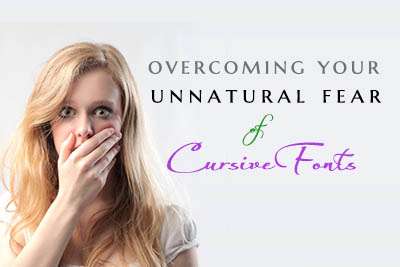
Overcoming Your UNNATURAL FEAR of Cursive Fonts
The unspoken fear all web designers dread - you've been asked to use cursive fonts! There is no escape... yes, it has happened to me, Bob Atchison, many times and I have the battle scars to prove it. Here are some cursive fonts I actually like.

Should You Use WordPress for Your Website?
We get asked this question all the time... Should I use WordPress? Here are some of the top considerations to examine when deciding if WordPress is the right choice for building your website.

Drone Photography for Home Builder Websites
As homes in Austin, Texas are getting more expensive and selling for well over $1 million, many home builders and real estate agents are turning to aerial drone photography and videos to showcase their listings.

Is Scotty Bowers Telling the Truth About Hepburn and Tracy?
Is Scotty Bowers, the famous Hollywood pimp telling the truth about Spencer Tracy and Katharine Hepburn being gay? Here's a confirming story...

 New Home Builder Website Checklist