
It’s Friday, July 24, 2026 in Austin, Texas
My Top Ten Most Beautiful Pictures of Austin
I have spent years looking at pictures of Austin - and these are my favorite - most outrageous beauties!
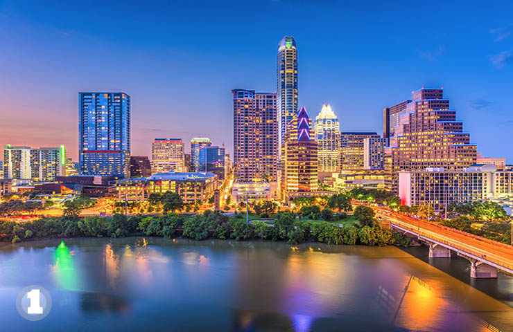
The Emerald City of OZ
This is the view most people associate with Austin. In picking images of the Austin skyline you have to watch for the changing skyline. Nothing can date the images of Austin you use in your website and marketing materials if a new building is missing. This is especially challenging if you aren't a local and not current on the latest new skyscraper or condo tower. No where is it more apparent what has been happening to Austin than to look at the skyline. We have out-of-control grow that is making the city increasingly unlivable. Traffic is horrible. Our bad traffic ranks near the top of worst places to drive and commute. Housing costs have gone through the roof and are still climbing. It seems like everybody wants to live here and is planning to do so. We have excellent jobs but they are not as high paying as you would expect because many UT grads decide to stay here after graduation and the job market is full of highly educated and over qualified people. This picture is full of saturated colors - it is almost a rainbow of them. I have called it the Emerald City because that is really how Austin appears - especially to non-residents - beautiful and alluring.
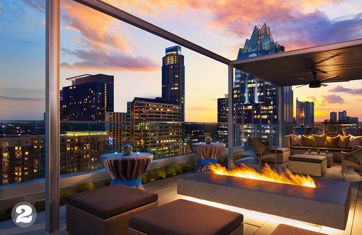
Fire in the Sky - the Azul Rooftop Pool Lounge
The fire in the pit seems to be reflected in the sky. There are some great touches of blue, too. I like this picture of the Azul lounge - you can almost feel the heat and what a view! This is a great picture to illustrate nightlife on Austin. But where are the people! This place should be packed. If you take pictures with people in them and use them professionally you have to make sure you have releases from them to use their image. One advantage to using stock photography is that you know you don't have to worry about using them in websites and marketing materials. You may not have noticed that even the biggest magazines use stock. One assumes that their cool color spreads are photographic sessions ordered by the job, but most are not. I was looking for some pictures for a home builder website last week and saw the same white kitchen pictures being used in a dozen of the top websites and in their print magazines. The pictures looked fabulous -on the level of Architectural Digest.
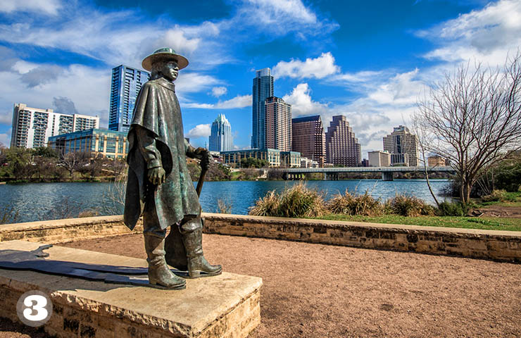
Stevie Ray Vaughan Statue - Auditorium Shores
I really like this picture for the incredible blue sky - wow great clouds there - and the weathered green patina on the bronze statue. The slight rusty color of the gravel and the light yellow limestone are nice earthy color contrasts. There are also many cool contrasts in surfaces, look at the soft blue and glassy water with that crushed gravel and the grass. This was a winter picture - you can see the trees are without leaves.
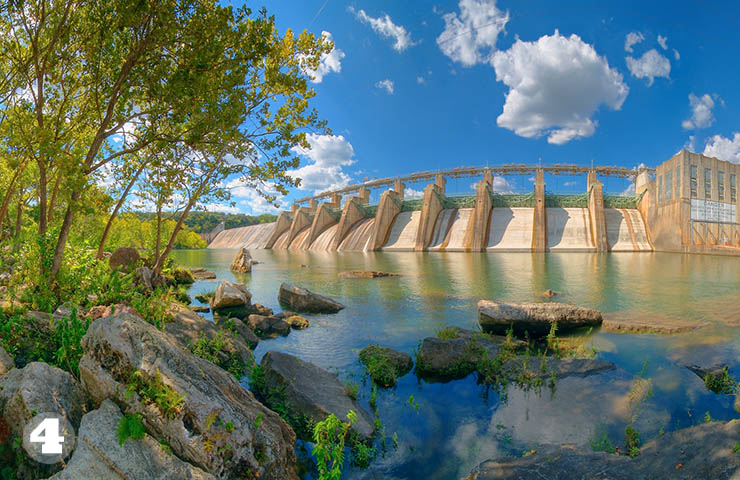 Mansfield Dam
The water here is multi-colored - it looks almost like some semi-precious stone - like deep blue Lapis Lazuli mixed with greenish blue Azurite. The rocks and the trees make this look like a scene from Avatar. pools and lakes around Austin have curious colors in them due to the algae and aquatic plant life. We are lucky our local waters are as clean and healthy as they are. Few urban areas - especially one growing as fast as Austin manage to preserve water quality. That lake is full of animal life - turtles, fish, and yes - snakes. When I first moved to Austin I was warned about the snakes in Lake Austin, and how they carried people off in packs. I fell for it. I see those snakes swimming in the water, but they seem to stay away from people and I have never met anyone who has been bitten by one. Now. I am more concerned about the escaped pythons that are loose in West Lake Hills and breeding. Dead ones have been spotted in Steiner Ranch - road kill
If you aren't from Austin you will ask - does this dam really look that great? Yes and it does, it was built in 1941 and looks vaguely Art-Deco or WPA. It was commissioned in 1937.
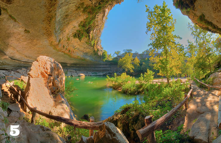
Hamilton Pool
Hamilton Pool Preserve is a natural pool that was created when the dome of an underground river collapsed due to massive erosion thousands of years ago. The pool is located about 23 miles west of Austin, Texas off Highway 71. Our landscape has been shaped by the interaction of water and limestone like this. I like this picture because it really captures the sweeping arc of the limestone cliff. The wood railings twist around like dinosaur bones. My brother thinks the Hamilton Pool is the most incredible natural wonder we have around here. Once again the colors in the water are jewel-like, but in this case they are caused by a high-bacteria level in the pool. You have to make a reservation to go here in the summer and pay for admission.
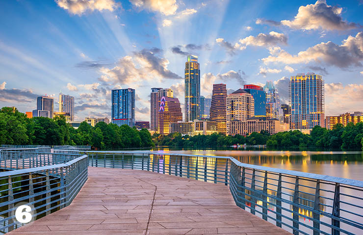 You Can Almost Hear the Voice of God in this One
Yes, this image looks like a scene from the Ten Commandments by Cecil B. DeMille. Ah, echoes of Vista Vision here. A highly saturated Technicolor world. I like this picture because of the the contrast between the patterned metal railings, the textured concrete pathway with the water and the awesome skyline of Austin across the back. There are red, purple, blue and gold lights on the buildings. Austin really glows like that at night. Like many places in central Texas we get these fast changing cloud patterns. Clouds sweep rapidly across the landscape and we really get those dramatic light rays. The lush green trees along the lake are pretty, too. People prefer blues and greens over all other colors. Deep royal blues - we use them all the time in websites. People trust websites with blues in them - rich skyblues like this. Dark navy blues convey trust. The main thing to remember about blues is they must always contain some green in them. Blues that tend towards purple can feel brittle and stand-offish. It's the same with greens - greens that tend towards blue are preferred by most people. I think there is something genetic in how we react to colors. Blues and greens feel more natural and healthy - we want to be around them. They are the colors of clean water and freshness. You can do a lot in a website with various blues combined with some green and reddish oranges and golds.
I think the longer you live in place the more you loose the ability to see things the way tourists or newbies do. Anyway this a great picture to contemplate our rapidly changing skyline.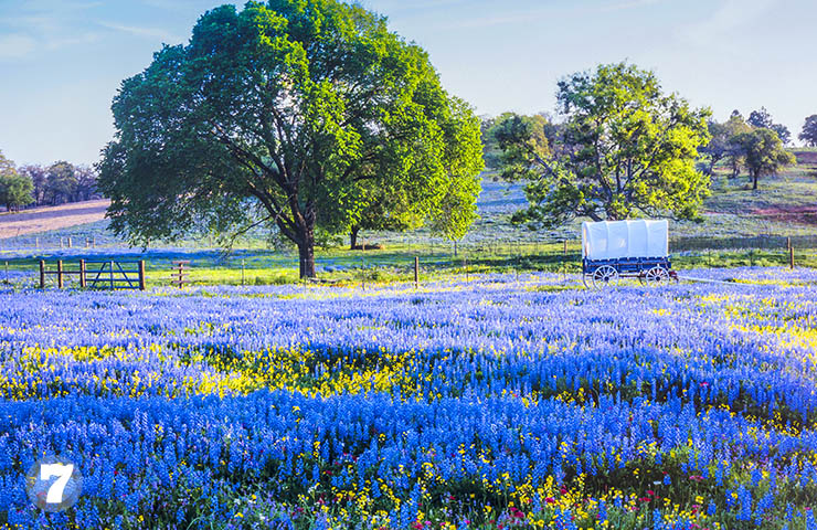 Central Texas Bluebonnets
The Texas bluebonnet or Texas lupine is a species of lupine endemic to Texas. With other related species of lupines also called bluebonnets, it is the state flower of Texas. It really does look like this at the height of the blooming season. For my eyes - and everyone sees colors differently - the color of bluebonnets is a bit strange and unnatural. The blue trends toward purple a little. What I like about this picture is it really shows how the flowers seem to grow in lush waves. They really are this thick and beautiful. In websites we build for Central Texas companies our customers ask for at eat one picture of bluebonnets. I think I have looked at a hundred this year alone. This picture has a pale sky and in the background are some soft purple mauves - that's a nice delicate touch in contrast to the bold color of the flowers. The raking light hits the trees and sets off the green nicely, too. So, this is my favorite Texas bluebonnet picture.
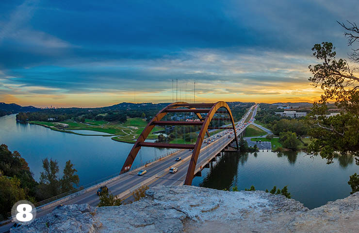
Pennybacker Bridge
The arches of the Pennybacker are so strong they are almost brutalist architecture. It was built in 1982 and crosses Lake Austin and the Colorado River. In Summer the rust colors of the bridge blend nicely with the hills and the lake. When you comedown the 360 hill and cross the bridge you get a feeling of of power - like taking off in a jet plane. The bridge has become one of Austin's seven wonders of our world here. This image is rich and strong - just like the bridge. The deep blues of the lake and the bits of green lawn look wonderful together. The sunset adds oranges and golds that go so well with Lapis and deep teal blues.
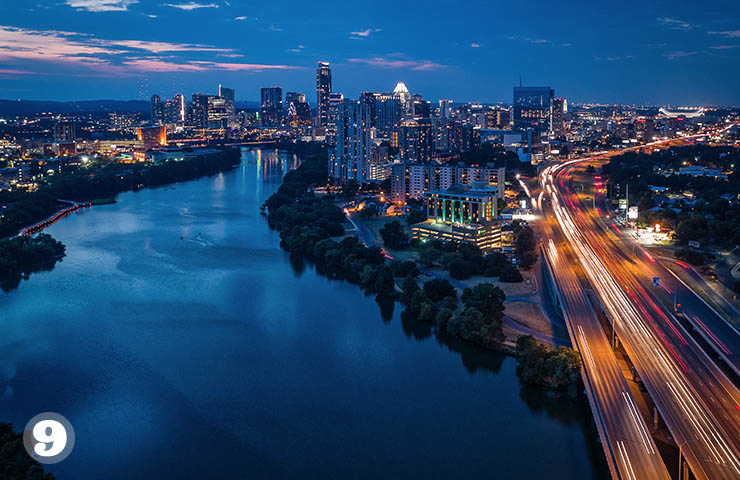 Austin at Night
I like the sweeping arc of the gold and red headlights crossing the dark blues of Lake Austin. Those bright green lights on the side of a building add a nice touch that is mirrored in the water of the lake. There are a number of converging lines here that give the picture a lot of life. The dark green trees along the lake make a jagged edge that adds more energy in the darkness or the navy blue water. It's not obviously Austin. This panorama of the city is not as familiar as others are taken from across the Lake. I assume it was taken with a drone. This image has a lot of pop and it is one of my favorites. Lake Austin looks so rich and deep. I love the darkest blue you see right were it passes underneath the bridge. I would call that a deep Cobalt blue. Farther up the lake you can see Cerulean blue reflections. Cerulean is a color term that ranges between blue and azure. Pantone (the color people) called pale cerulean the color of the millennium.
 Reds and Blues That Work Well Together
This picture contrasts with all of the other ones I have selected because it is flat and graphical. The dull tomato red and the rusty orange blend well with the sky blue and the white. I picked this image because it conveys something of the sassy Austin spirit. True red - let's call it Coca Cola red - is a very challenging color to use. It can be so strong that it overpowers and other color. You have to pair it pure white. On the web JPEG compression of reds is very iffy - you get weird pixelation or artifacts in the color, even at the highest quality of compression. GIF works better as a format for red graphical elements in websites. In this picture we don't have any problems with rendering the red because it is less saturated and is almost brown. Putting red next to blue like we see in this picture is normally a serious no-no in color pairings. Putting them together can cause a mental sensation of vibration that can be disturbing. One can sense this a little if you concentrate on the line between the colors.

AUSTIN
the most beautiful
My Top Ten Most Beautiful Pictures of Austin
I have spent years looking at pictures of Austin - and these are my favorites - the most outrageous beauties! I have added some comments about colors and life in Austin.

TECH ADVICE
stop them once and for all
How to End Annoying Robocalls - OMG a Solution!
Get rid of Robocalls. There is a free solution that really works - it's called Nomorobo and we love it.

WEB DESIGN
big breakthrough in color research
Want to Use the Viking Color Palette in Your Website?
Scientists have discovered the favorite Viking colors and now you can use them in your website!

WEB DESIGN
be prepared - choose wisely
Checklist for Law Firms Looking for a Web Designer
Here are some helpful hints and direction on the skills and knowledge your web designer should have.

WEB DESIGN
essentials for success
New Home Builder Website Checklist
Here's a list of the essentials you'll need to create your new home builder website. It's a list of all of the building blocks you'll need to make your site a success.

WEB DESIGN
max speed
7 Tips to Speed Up Your Website
Optimizing the speed that your website's content loads - will inevitably increase customer satisfaction, keep them on your website, reducing its bounce rate, and hopefully make them return visitors.

AUSTIN
save as many as you can!
Top 10 Reasons NOT to Move To Austin
With Austin making headlines and ending up on virtually every "Top 10 Best City for..." lists -- we now have about 150 people moving here daily!! We figured we should warn potential new residents of the hidden dangers of moving to Austin.

ANCESTRY RESEARCH
Howdy Grandmother!
Pocahontas ancestry and DNA - Sullivan Family Connection
How I discovered my ancestor Pocahontas and her Sullivan family descendants of Northern Virginia using the web - a genealogy posting by Bob Atchison.

Anonymous Love Letters - $500
Did you know that really was a profession? In 1961 you got paid $500 per letter, that would be $4100 today!

SEO Tips for Home Builders
When we build a new website for our home builder clients, we always try to focus on implementing "best practices search engine optimization (SEO)" to maximize their placement in organic search engine results.

GEDmatch Used to Snare Golden Gate Killer - Hackers Get MyHeritage Data
As you have probably read it has been extensively reported that Golden Gate Killer was found using data from GEDmatch. It's an amazing story.

Keller Williams Real Estate Agent Website Created
Pallasart launches new real estate website for Matthew Church, an Austin Keller Williams Associate. The site has many cool features that will help Matthew offer his services and attract new customers.
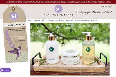
Hummingbird Farms Upgrades Images on their Website
Hummingbird Farms, the famous maker of body lotions seen on QVC , upgrades website with huge new product images, which increases sales
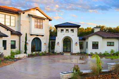
Top Texas Home Builder Redesigns Website
Olson Defendorf, the top award-winning Texas custom home builder, creates a new brand image and redesigns website. Click here to see what they just did in 2018.
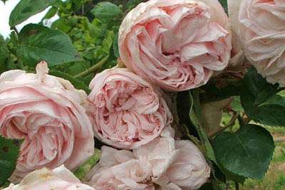
The Best Antique Roses for Your Austin Garden
Here's a list of the best antique and old roses for your Austin garden plus a few recommended David Austin Roses
Maine Resort Redesigns Website
The Moorings in New Harbor did a total redesign of its website and added an availability and booking system.
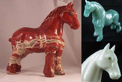
My Favorite Semi-Precious Stones for Hardstone Animals
Here are some images showing my favorite semi-precious stone animals with jeweled eyes from my collection and stories of the stones and where they come from.

Why do my website fonts and photos look blurry in Windows 10?
When users install or upgrade to Windows 10, "display scaling" may be turned on "by default" to either 125% or 150% resulting in blurriness when viewing websites or applications on certain monitors.

5 Common Website Mistakes to Avoid Making
We've been in the web design business since 1996, and have seen many small businesses make these easily avoidable but often costly mistakes with their websites.

Should You Use Live Chat in Your Website?
Here's an informal overview of live chat options, outlining how Olark, one of the leading providers, works and its features. We explain how live chat can increase online sales and generate leads no matter the size of your company.
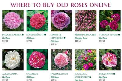
Where to Find and Buy Old, Antique and David Austin Roses Online
Bob Atchison's guide to find rare, antique and cabbagey roses to order online. Here you'll find the best sources with roses I especially love and recommend for your garden.

How to Add MLS Listings to Your Real Estate Website
If you are a realtor or real estate broker, you need a website to advertise your business and attract new clients. Get clients to stay on your website by providing access to Multiple Listing Service (MLS) real estate listings.

New Real Estate Web-Tools Just Released
Now it's possible to have a website that surpasses the very best in real estate. You can get an incredible design with powerful databases that can do anything and everything you could dream of...

Overcoming Your UNNATURAL FEAR of Cursive Fonts
The unspoken fear all web designers dread - you've been asked to use cursive fonts! There is no escape... yes, it has happened to me, Bob Atchison, many times and I have the battle scars to prove it. Here are some cursive fonts I actually like.

Should You Use WordPress for Your Website?
We get asked this question all the time... Should I use WordPress? Here are some of the top considerations to examine when deciding if WordPress is the right choice for building your website.

Drone Photography for Home Builder Websites
As homes in Austin, Texas are getting more expensive and selling for well over $1 million, many home builders and real estate agents are turning to aerial drone photography and videos to showcase their listings.

Is Scotty Bowers Telling the Truth About Hepburn and Tracy?
Is Scotty Bowers, the famous Hollywood pimp telling the truth about Spencer Tracy and Katharine Hepburn being gay? Here's a confirming story...
 New Home Builder Website Checklist