


Making Effective use of Color in Websites archived web marketing tips and articles from the past
Making Effective use of Color in Websites
When discussing the design of a new website, a question that consistently arises is - “How do I select the most effective colors?” Choosing the right color palette for a site is essential to communicate your message, brand your product or service, and, if you are an online business, sell your products. Everyone has favorite colors, but how those colors are interpreted may vary from culture to culture. Color communicates far more than most people realize. Choosing wrong colors can be a disaster for your website. Work with one of the best website design companies in Austin, Texas and let us help you select your color palette.
 Read our new blog article - Good Cursive Font Choices - Overcoming your Unnatural Fear of Cursive Fonts
Before selecting colors, we ask the following questions:
- Who are your site’s potential visitors?
- What are your products or services?
- What are your site’s key objectives?
Your website’s potential visitors might come from a global or regional market, or exclusively from North America. Did you know that the color white symbolizes mourning in China, or that purple is the color of death in many Catholic countries? Yellow is an Imperial color in Chinese countries, but in America it may symbolize cowardliness or urine. More important, shifting colors to another area of the color spectrum can completely change their impact. For example, yellow shifted toward red results in a color that indicates gold or ‘having value.’
Your visitor demographics also can make a difference in how colors are perceived. Young people are drawn more to saturated colors than adults, who may find them garish or offensive. Strong color contrasts can also drive older visitors away. While young people may respond positively to new color trends, these fashionable colors can be overused and go out of style as quickly as they appear. Text and background color choices also affect readability, which can be an issue for older visitors and those with visual impairments.
The following is a list of colors and potential meanings:
- Red: passion, romance, fire, violence, aggression. Red means stop, or signals warning or forbidden actions in many cultures.
- Purple: creativity, mystery, (reddish purple) royalty, mysticism, rarity. Purple is associated with death in Catholic cultures, as mentioned above.
- Blue: loyalty, security, conservatism, tranquility, coldness, sadness. Light blues create a feeling of openness, clean air and freshness, while dark blues can convey tradition, trust and solidity.
- Green: nature, fertility, growth, envy. In North American cultures, green means ‘go,’ is associated with environmental awareness, and is often linked to fiscal matters. A lighter, somewhat desaturated green is the color of money and indicates wealth or value.
- Yellow: brightness, illumination, illness, cowardice. Some yellows can symbolize the precious metal - gold - and are universally valued.
- Black: power, sophistication, contemporary style, death, morbidity, evil, night.
- White: purity, innocence, cleanliness, truth, peace, coldness, sterility. White is also the color of death in Chinese culture, as mentioned above.
Many websites today clearly reflect the negative effect of bad color choices. People often choose colors to 'dress-up' their site without any regard to their site’s objectives.
Here are several mistakes commonly made in selecting website colors:
Colors are selected that conflict with your brand, service or products.
If you have a well-known brand like Coke, you can use bold colors like 'Coca-Cola red' as much as you want without concern. However, very few companies are in the unique position where the brand name is more powerful than their brand color. Less well-known businesses should carefully consider the colors they choose for their logos and website. Certain colors work well with specific types of businesses. For example, warm colors, such as reds, yellows, and oranges – often called a 'fiesta palette,' can work well for food sites and restaurants that offer spicy fare. Colors in the warm range can also be effective in selling products associated with sun, passion or sensuality. Creams, whites and dark brown colors can be used successfully on websites that sell chocolate products. Cool colors, such as blues and greens, complement outdoor products, airlines, medical services, law firms and intellectual content. These colors can reflect trust or a relaxed attitude. As one person has noted, "… the color blue has a relaxing effect on the nervous system, and some studies have shown that it increases productivity when used as a background color. However, don't use blue in your color scheme if your product is food-related, as blue is a natural appetite suppressant."
The web site uses saturated background colors that fight with your site’s content and make it difficult to read and navigate.
If your site uses product pictures or headlines with important messages, you should always chose a desaturated background so the images will ‘pop’ or ‘stand out’ on the page. A saturated background will dominate your page, causing both the content and images to be lost. Not only will your content be hard to read, your pictures will lose their effectiveness and your site will be difficult to navigate. The colors of your product pictures and key messages should always be more highly saturated than your background colors. Keep in mind that graphics and areas on your site with the most saturated colors will attract the visitor’s eye first. Here's an example:

On the left you can see a product name and picture on saturated backgrounds. Next to the graphic is an example with lighter, less saturated color backgrounds. As you can see, the less saturated colors on the right complement and 'sell' the product name and picture more effectively.
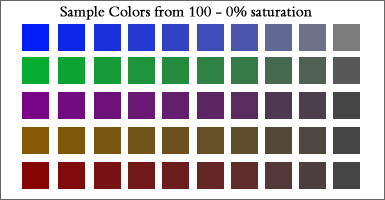
The example above shows color saturation reduced by 10% each step. You can see that colors move from garish to modulated to dingy as they progress from left to right. The 4th through 7th colors in each row are the best choices.
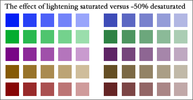
This example shows the impact of changing colors from saturated to desaturated, moving from dark to light for each color sample. The saturated colors on the left retain their 'pop' even when made lighter, while desaturated colors move into the background and become more muted as they become lighter.
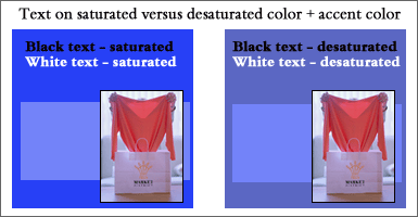
The example above shows how back and white text appears on saturated versus desaturated color backgrounds. White text has more ‘pop’ on a saturated background while black text is more readable on a desaturated background. The white text on the desaturated background 'shouts' less, as well. Note that the product picture appears more intense on the saturated color box, while the blue box looks less blue on the saturated color box. The picture and blue box are the same color in both examples. The desaturated example is most effective.
Your website uses too many colors.
Color harmony is the most important criteria when selecting colors. We recommend selecting a moderate number of colors. Four or five colors, plus black and white, should be sufficient. Too many colors create discord and will distract the user.
Contact Austin web designers.to discuss your website and colors.
Learn more about putting these website elements to work for you:
Color | Fonts | Search Engines | Optimization
here are some
archived web
marketing tips
and articles
from the
past
- 10 Top Design Tips - essential ideas to make your site a success
- How to Select the Right Fonts for your Website
- Trends in Logo Design and How to use Logos in Websites
- Pallasart's Guide to Search Engine Optimization
- Pallasart's ABCs - Dictionary of Technical Terms
- Walt's Overview on Internet Video
- Making Effective use of Color in Websites
- Why a web page may look different on different computers
- The Austin Advantage
- Using Social Networking Sites Like Facebook and Twitter to Promote Your Business
- Royalty-Free Stock Photography Sources