


How to Select the Right Fonts for your Website archived web marketing tips and articles from the past
How to Select the Right Fonts for your Website
Compelling images, beautiful colors and a user-friendly design are key to a successful website, as are the fonts you select to tell your story.
Knowing which typefaces are most effective in the web environment can mean the difference between a website that engages your visitors or turns them away. Although there are a myriad of fonts from which to choose, only a handful of these fonts are successful on the web.
Here are some basics about fonts and a few tools that will help you make the best choices for your website. If you would like more information contact an Austin web design company that can help you.
 Read our new blog article - Good Cursive Font Choices - Overcoming your Unnatural Fear of Cursive Fonts
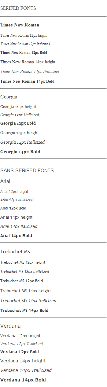
Serif vs. Sans Serif
In the world of typography there are five basic types of fonts: serif, sans serif, cursive, fancy and monospace. Of these, serif and sans serif fonts are used to present bodies of text. The first step in selecting a font for your web site is to decide whether you want a serif or sans serif font and to know how they differ.
Serif fonts have small strokes or lines that extend from the ends of letters and symbols. They can look like small feet, caps, tails, flags or dots. Because the lines make each character more distinct, serif text is easier to read. Serif fonts have been used for centuries in printed books, magazines and newspapers, and are the preferred fonts for text that has a “humanistic theme.”
• Consider a serif font for your website if you wish to convey one of these qualities: warm, personal, artistic, stately, traditional, conservative or intellectual. Serif fonts are effective as headings, for main body text and for documents that is intended to be downloaded and printed.
Sans serif fonts are simple and straightforward, and lack the “lines” of the serif fonts (“sans” is French for “without”). Because the individual characters of sans serif fonts are less distinct, they are harder to read. A lack of individual detail also gives them less personality. These fonts are typically used for newspaper headlines, photo captions and technical documents. Because computer screen resolutions vary, serif fonts can look blurred on many computers. The simplicity of sans serif fonts makes them easier to read on computers. They are the preferred choice for web site and PowerPoint presentations.
• Consider a sans serif font for your website if you wish to convey one of these qualities: technical, cool, clean, crisp, youthful, modern or uncluttered. Sans serif fonts are effective as headings, for general text and for text with technical content. However, sans serif fonts can also be viewed as cold and impersonal.
Once you decide on serif vs. sans serif, the next step is to identify which fonts are most effective and accessible on the web.
Finding Common Fonts
PCs and Macs have different operating systems and, in many cases, different fonts. New fonts have been developed since the advent of computers and many traditional typefaces have been adapted for each system, some with varying degrees of success. As a result, some fonts look better on PCs (such as Arial), while others are best viewed on Macs (like Helvetica and Geneva).
One new typeface in particular - Verdana - was released in 1996. It is a sans serif font with a “humanistic quality” and looks good on both PCs and Macs. Because of this, it is one of the most popular, widely-used fonts on the web. (Note: You are currently reading text in Verdana.)
To control how your web page text is displayed, it’s important to choose a serif or sans serif font that comes pre-installed on both PCs and Macs. If your website features a font that is not pre-installed, the user’s browser will display your page using the browser’s default font. This will change the overall look and feel of your web site. You can avoid this by choosing a font common to both operating systems.
Choosing the Right Fonts
Several fonts that come pre-installed on PCs and MAC are listed below. By selecting one of more of these fonts for your web site, you will be able to control how your text will appear on most browsers.
Serif: Times New Roman or Georgia
Sans serif: Arial, Trebuchet, Verdana, (Andale Mono, Impact)
Examples of these fonts are presented below in various font sizes and styles.
Once you've selected the font for your main body text, it’s time to choose a font for non-graphic headings and sub-headings. It can be the same font as your text or a contrasting font. Your site’s overall design should help you decide which style is best for your site.
Tips: Consider the message you want your site to convey. Keep the overall design and visual flow of your site in mind. Look at other web sites in your industry that appeal to you and see if you can recognize the fonts. Chances are they will use one of the fonts from this list.
Sizing the Text
Now that you've chosen your fonts, it’s time to establish the size of your main body text, headings, sub-headings and other text elements.
For the main text, start with the most common and readable font size – 12 px. If 12px. looks too large, try 10px. (Note: System fonts are available in certain sizes, such as 8, 9, 10, 12, 14, etc.) The visual height and width of individual characters may vary from one font family to another and between serif and sans serif fonts. Trust your eye to tell you the best sizes.
Suggested font sizes for these text elements:
Text: 10px or 12px
Main Headings: 14px, 16px or 18px
Sub-Headings: 12px or 14px
Captions: 8px, 9px or 10px
(Tip: Avoid 8px and 9px type for your main body text. Most people won’t take time to read text this small, especially older individuals and those with visual impairments.)
Adding Style
You can add style and interest to your text through the use of “attributes.” These stylistic elements introduce variety and help you better convey your message. The most common font attributes are plain, bold, italic, underline, capitals and color. When used, these elements become part of your site’s overall design. If used sparingly, they can be effective. When overused, your page can look cluttered and unprofessional. Be consistent when applying attributes and remember that “less is more.”
• Plain: Use for main body text on white or light backgrounds and large headings.
• Bold: Use for emphasis, such as headings and sub-headings, key words, text menus and small blocks of words. Use sparingly. Consider using bold for main body text when light text appears on a dark background.
• Italic: Use for emphasis, such as key words, quotes, photo credits, captions and titles. Too much italic is difficult to read. Use sparingly.
• Capital letters: Use basic rules of grammar in applying capital letters in your text. For headings, you can use either a lower case or capital letter for the first letter of your heading. (Ex: about or About)
• CAPS: Avoid using all capital letters except for very short words. All caps appear as BLOCKS OF TEXT and can be distracting and difficult to read.
• Underline: Avoid using underlines on web pages because underlined words can be confused with links.
• Color: Use color to attract attention (i.e., Go, Stop, Look!) or to emphasize a word or select group of words. Make sure your color choices complement your overall web design. Use additional color sparingly or your web site will look cluttered.
Conclusion
Once you have selected fonts for your website, decided on font sizes and attributes, your choices will be coded into a style sheet that will dictate how text will appear throughout your web site. Any desire to change font family, size and/or attributes to select text on individual web pages can be handled through the admin section of your web site.
While fonts may not seem as important a design element as color and graphics, thoughtful consideration should go into your selections. The fonts will convey important information about your company, products and services. They will help visitors navigate your site and interact with you. Read about our web design services.and contact us to discuss your website and fonts.
Most important, the right fonts will contribute to your site’s overall mood and visitor experience. If it’s positive and easy on the eye, you know you've made the right choices.
Put these website elements to work for you:
Color | Fonts | Search Engines | Optimization
here are some
archived web
marketing tips
and articles
from the
past
- 10 Top Design Tips - essential ideas to make your site a success
- How to Select the Right Fonts for your Website
- Trends in Logo Design and How to use Logos in Websites
- Pallasart's Guide to Search Engine Optimization
- Pallasart's ABCs - Dictionary of Technical Terms
- Walt's Overview on Internet Video
- Making Effective use of Color in Websites
- Why a web page may look different on different computers
- The Austin Advantage
- Using Social Networking Sites Like Facebook and Twitter to Promote Your Business
- Royalty-Free Stock Photography Sources