-
See a Great Pallasart Website Makeover Comparison
In late 2014 Sun Burst coffee asked Pallasart to redesign their website and create an entirely new shopping cart from scratch. Every shopping cart is unique, but this one had special needs. Sunburst had an elaborate discount program. Their goal was to increase sales for each shipment. They wanted customers to buy extra bags of coffee to reduce the per-bag shipping cost and increase profit margins.
Below is an comparison of the old and new sites, it was completed at the end of February 2015. The old is on the left and the new is on the right - look for the big red bird! If you click on the image you can see a larger version of it. We'd love to take to you about a site make-over for your online business. Call us or send us a quote request and let's get the ball moving. 512 547-7315 - that's our number (we're in Austin, Texas) - and ask to speak with Bob Atchison.
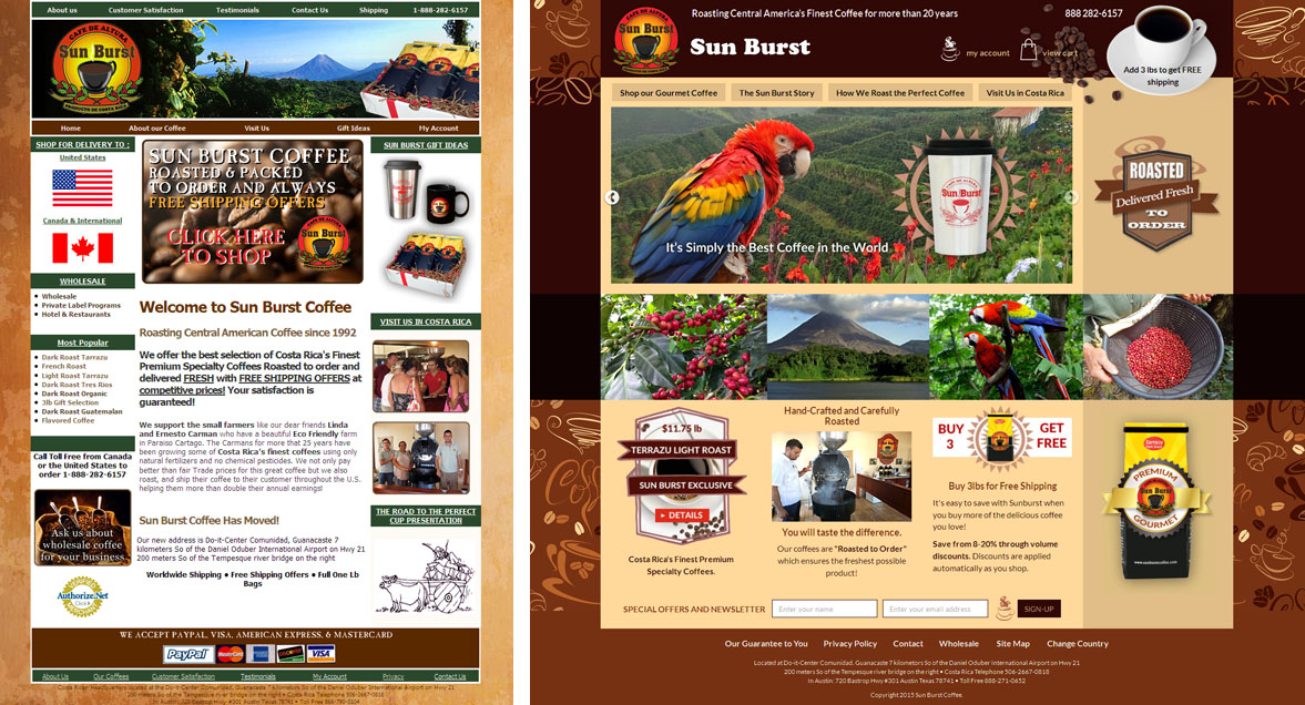
Sun Burst has a retail store in Costa Rica, all of its sales outside the brick-and-mortar store were web-based. Many Americans discovered Sun Burst coffee during holiday trips to Central America. There are tens of thousands of Sun Burst Coffee fans across the USA. The coffee has a dedicated following who love the coffee and order it regularly. It was both a "familiar friend" and a delicious coffee.
The site had an old design, was very small and was not responsive. It looked dated. The design was acceptable ten years ago, but needed a complete overhaul.
We wanted to accomplish three things in the design.
First, we wanted to update the web presentation with a big, bold and unforgettable design. There are many online coffee roasters, we wanted to push the brand out in a unique and unforgettable way. We wanted to create a new, bright website that visitors would instinctively remember and come back to, over and over again. We wanted to present the brand as a 'personal reward' product that consumers would buy over and over again for themselves.
Second, we wanted to position the product as an established brand that was better than all the others. We wanted people to be able to taste the coffee and pair it with care-free travel, exotic Costa Rica images. This association will create a brain-bias for the brand. Coffee is one of the post positive smell associations Americans have. People who buy coffee always associate their favorites with taste and aroma. They also associate it with the places they have enjoyed it. This is why people think Starbucks produces great coffees, if you have positive experiences in their stores and drink the coffee there you mix the two together in your mind.
Third, we wanted to make it as easy as possible to buy coffee quickly. The site is very shallow in its navigation. You can check out fast. It fits on smartphones, iPads - everything.


We are one of the leading developers of home builder websites in the USA with years of experience in designing powerful sites that are easy to navigate. No matter what the size of your business we can work you to structure a site that showcases your unique talent brand identity. We can offer you lots of great features, floorplans, lots, elevations, choose your own finishes, videos and spec homes for sale. Besides being beautiful, our sites are easy to use and update. Call us at (512)547-7315 and let's talk about your project.