How Ikons Are Created - Painting the Ikon
As mentioned earlier ikons are painted from dark to light. It is a painstaking technique and requires the use of fine-tipped brushes. In order to achieve the fused method of modeling, which creates seamless graduations in tones it is necessary to make many subtle lightenings of the pigment which are applied in a very fine cross-hatching effect. Another method is to blur the edges of each successive coat with pigment which has been more diluted in water.
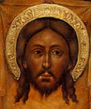
The first example at top left shows a detail of the face of St. Catherine of Sinai. In this ikon the 14th century Byzantine artist has used a rather dark underpainting, using a dark umber color mixed with white. After painting the undertones of the face the next step is to draw the dark lines upon the face in dark umber. The first face tones the painter has laid on in the fused, method. This can be determined by the lack of noticeable lines at the transition point between the underpaint and the first light flesh tones. In the fused method one uses a combination of water-diluted color with a very soft application of the paint in the transition zone. This may be hard to understand, but I promise you will learn it as you attempt to create this smooth transition yourself. The traditional flesh tones are generally made of Yellow Ochre mixed with a small amount of red, white and umber. The following lighter layers of face tone are made simply by adding more white. Midway through the process of building up the face a small amount of flesh tone should be taken aside and mixed with a touch more red and a bit of umber. It is better to err on the side of using less, rather than more. This tone is then dilutes and used for the rosey tones of the checks and lips. Notice that the painter of St. Catherine has used a lighter tone for the cheeks and that this is under the topmost layers. Also notice that the nose has a rosey zone along it's right edge and that the chin has one also. Looking very closely it is possible to observe that the lower part of the neck and the edge of the forehead is treated in a similar, subtle way. Strive for a fused effect with the rosey tone, showing no lines.
The final light flesh tones can be seen to have been laid on in a contour effect and the brush strokes are visible. The artist has followed the contours of the various features of the face. leaving the lines visible is a conscious effort by the artist. Finally bright highlights have been placed along the same facial contours in key places. Study these very carefully, for all ikon faces follow a similar arrangement. This tone of white is actually not very bright and be careful to use a very light tone of your flesh color here rather than plain white, which would be too garish. The eyes take special treatment. Notice that the artist had used the fused method in the eyes, and has even outlines the dark-edged iris with a barely detectable outline of light tone.
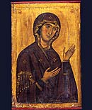
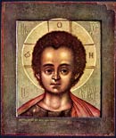
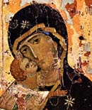
The second ikon detail at left is from a Russian painting of St. David from the 15th century. The artist has used a lighter underpaint than the painter of St. Catherine and it has a greenish tone. A lighter underpainting in facial tones against a color background makes the facial tones harmonize more effectively. Here the artists has also chosen flesh tones which are much rosier and closer to the color of the underpaint. This makes it easier to achieve the fused effect. Here the highlights are much brighter and more abstract. The lines of the drawing on the face are also more red. This ikon certainly has a more calligraphic quality.
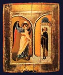
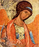
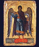
The first example of drapery painting at left is a detail from a 14th century ikon of the Annunciation from Constantinople, now in Orhid, Macedonia. It shows the leg of the Archangel.
Here can clearly be demonstrated the ikon method of painting garments. First the artist has painted the undertone, in this case a neutral grey. Next the painter drew the outlines of the drapery and then applied some broad areas of darker shadow (overuse of overly dark shadows can make your figures seem overworked, restraint is called for). Two layers of highlights are applied. Notice here that some 'lines' in the drawing of the garment are created by these highlights. This is called the three tone method, since there are three tones added to the underpaint of the garment (the lines of the drawing are not considered tones). The three tone method is also used in architecture and landscape.
Sometimes alternate colors, such as green or pink on blue, are used in the lighter tones to create contrasting tones which imitate shimmering fabrics such as silk or brocade. This can be seen in the garments of the left-hand Angel in Rublev's great ikon of the Old Testament Trinity.
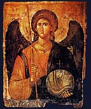
Specific garment colors are assigned by tradition to specific saints and Holy figures. For example, Christ and the Virgin's robes are always in royal shades of Imperial Purple or rich Blue. The only exception is in some ikons depicting heaven, when their robes are white. The Archangel Michael's outer cloak is usually red or purple while Gabriel's is blue or a greenish blue. This was helpful in the days when few people could read. Christians could recognize who they were praying to by the colors in the ikon. Ikons always carry inscriptions identifying the scene or the saint shown for the same reason - it was important to know who one was praying to.
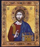
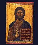
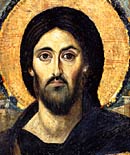
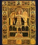
Finally, gold is used to highlight garments as well. In the example at left from Rublev's Christ in Glory the use of fine gold lines which have the effect of building up volume can be clearly seen. Use of gold highlights the image seem more abstract.
Request a quote on a painting seen on this page or a new commission from Bob Atchison, click here.
Next chapter: Gilding & Varnishing